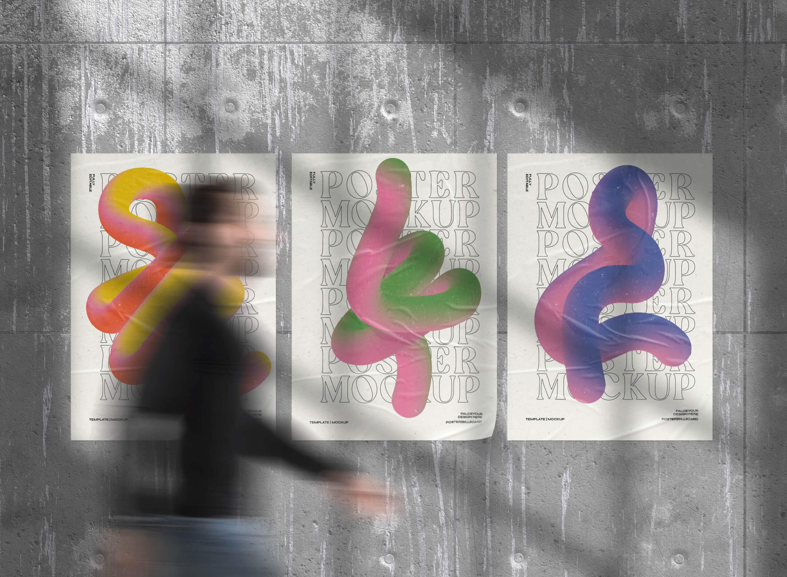
04 Aug Common Design Mistakes for Flyers and Posters
Even in the digital age, flyers and posters can make a big impact on your advertising efforts. Whether you are advertising an event, special offer, or flash sale, a poster or flyer can help capture customers’ attention and quickly convey the information they need. However, poorly designed posters and flyers may only end up costing you money, as they may not capture the attention of your target audience or provide them with the key info they need to take action.
Posters and flyers are an investment, so make the most of your printing costs and see a better return on your investment by avoiding these common design mistakes.
Poor Color Choices
Color can tell a story and elicit various emotions, making it a powerful tool in graphic design. For flyers, printing in black and white is standard, but you may choose to print black text on colorful sheets of paper instead to make them pop. Choose shades like bright yellow or orange to make a bold statement.
For posters, color use may be more nuanced. You might make use of more colorful images and text graphics, but choosing the wrong colors can make your poster difficult to read. If your text and backgrounds do not use colors that have high contrast, people may struggle to make out the text. In general, darker text over lighter backgrounds will be easiest to read.
When choosing colors, you might also think about branding if you are promoting a specific organization. Using brand colors is always a smart strategy to help readers instantly associate a poster or flyer with your brand.
Hard to Read Text
Poor color choice isn’t the only potential issue for readability in graphics and flyers. You need to be careful about your choice of font as well. Skip trendy, embellished fonts that might be hard to read and go for tried and true fonts like Arial, Helvetica, Franklin Gothic, or Calibri. It’s also important to be sure that letters are big enough to be read from a distance. Your headline and the most important info, such as dates and locations should be printed in larger lettering than any auxiliary text. Additionally, choosing a different font for your headline and body text can make a stronger visual impact and make your flyer or poster easier to read.
Too Much Text
Posters and flyers are both meant to be read and understood quickly, so you won’t want to overload them with too much information that can create a busy design with too many words. Conversely, you’ll want to ensure that all key info is available—be sure that you have the who, what, where, and why clearly conveyed in your design.
Low Quality Images
A picture is worth a thousand words, but only if it is displayed with crisp clarity. For flyers, it’s often best to stick to simple graphics rather than photos. For posters, make sure you choose high resolution images and send your design to a professional printer to be sure that the image is clear.
If you are printing any marketing materials for your business from flyers to posters to banners and signage, trust Reproductions Inc. for expert printing solutions in Tucson. Visit our local print shop between downtown Tucson and the U of A campus or call us at 520-355-4902 to discuss your printing needs.

